buzzcut

Haunted Virtual Mansion

Nov
30

What do you get when you mash up the American historicist fantasy of the home with the haunted house house, destination leisure, videogames and an insatiable taste for post-modern irony?

This:

This video provides a walkthrough of a Counter-Strike mod simulating the famous recreation in Disney World’s Magic Kingdom of the equally famous original facsimile haunted house in California’s Disneyland (The Disney World version is set in Liberty Square rather than New Orleans and oddly features a Tudor manor facade with ornament pulled directly from the chess board).
What to make of this? Well a few points come to mind and deserve some sort of integrated theory at some point:
  • The haunted house is a popular form of American myth
  • There is a specific form of haunted house that is distinctly American, although tightly tied to the Gothic revival in architecture of the early 1800 and conindicing with the rise of Gothic horror literature (such as Shelley’s Frankenstein in 1818).
  • The original Haunted Mansion shows the link to architecture is more tenuous than that to literature (since the Disneyland building looks like an antebellum mansion with a strong Greek revival portico and nothing of the Gothic).
  • However, the Disney castmembers who acts as guides in the ride model their behavior after dour Victorian maids and butlers.
  • Part of the fun of a Disney park is that it obviously plays with being real, while remaining childish and intentionally not real.
  • Which leads to a twin facincation with its reality/unreality that transfer through to a virtual recreation inside a game engine.
  • The video viewers facincation is, in part, a marveling at the level of detail that went into the recreation of the Mansion as a 3D model. An equal part of the attraction is reliving the ride in simulated form, recognizing detail that makes the artificial recreation feel more real.
  • The unifying principle of the Disney Haunted Mansions and Mansion simulations relates directly to their visibility–how much they look like amusing, stsylized version of places that only ever existed in imagination and literature.
Finally, I should point out, there are many more of these ride recreations. Ride simulation remains a healthy culture!
Uncategorized , 0 Comment

Will Wright: Architect

Nov
23

There's a wonderfully contemplative puff piece in the New Yorks Times about SimCity/Sims/Spore creator Will Wright.

The story lists short answers to oddball questions. The one that caught my attention was:

Recurring dreams: They are architectural. They are about very specific buildings and houses. I remember them down to the level where I can make blueprints of them.

Sure, you could make too much of the quote. Then again, I'll hang onto this as one more scrap of evidence in my growing suspicion that what architects have been doing for a long time is what videogame designers have started doing recently.

Posted by email from buzzcut blog (posterous)

Uncategorized , 0 Comment

The Ludic Age

Nov
18
During this year's Game for Change conference, quick thinker and creative mind Eric Zimmerman dropped a new concept on the audience, "Maybe, ", he suggested, "We are living in the Ludic Age ."

His point was well received by a room full of people hoping to change the world through play and games. And his concept made sense on the surface. The industrial age led to the information age and now that we are drowning in all that information and technology, maybe games were helping us figure out how to deal with it all. Whether we had entered the age of games or not, it seemed plausible to at least hope we were.
As I work through the question of "What makes a place fun?" I find another reason to give Eric's idea further consideration–the ebb and flow of the romantic and rationalist tendencies in culture.
If we think about Romanticism as reading truth in the visible and the human response to that truth, contrasted by the Rationalist tendency to seek natural truth beyond the surface, in the observable matter of the universe, then we set up the dichotomy that sticks with us to this day. Is truth empirical science or human experience? The Romantic movement is most closely associated with the an 19th Century reaction to the Rational efforts of the industrial age. Faced with the ugly truth of people treated like parts in a machine and tied to a ticking clock, the Romantics were concerned with the shape of experience and the power of narrative. The Romantic and Rational have pushed back and forth ever since.
Today, the Information Age, the Digital Age, is another Rationalist turn, whereby computers are seen as the basis for encoding all experience as binary quanta. Perhaps no one has voiced an objection to this point-of-view more eloquently than computer pioneer Joseph Weizenbaum when he wrote:

"Beginning perhaps with Francis Bacon's misreading of the genuine
promise of science, man has been seduced into wishing and working for
the establishment of an age of rationality, but with his vision of
rationality tragically twisted so as to equate it with logicality. Thus
have we very nearly come to the point where almost every genuine human
dilemma is seen as a mere paradox, as a merely apparent contradiction
that could be untangled by judicious applications of cold logic derived
from a higher standpoint Even murderous wars have come to perceived as
mere problems to be solved by hordes of professional problem solvers." (Quote in The New Media Reader, p374)

This from the man that programmed ELIZA a piece of software that famously simulated a psychologist. He was deeply concerned that we trusted our rational mode too much, up to and including considering his computer science experiment a viable tool for helping people with their psychological problems. His call for a new humanism stopped short of a Romantic point of view, but its decisive criticism of the Rational opens the door for an alternative.
Living in the shadow of Weizenbaum, as it were, perhaps now we see a Romantic turn, a return to the idea that play, imagination, creativity and sublime human experience matter more than the output of a computer. Perhaps, the "Ludic Age" is really a response to the Rationalism of the Information Age.
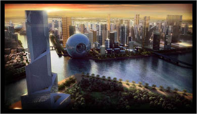
Turning to architecture, it's hard to argue that the super stars of architectural design have not already made the shift back to the Romantic mode. Koolhaas' Dubai projects can stand for the time and speak to a sensibility more Ruskin than van der Rohe, more play than work and more ludic than information. In short, more fun.

rem600.jpg 

Posted by email from buzzcut blog (posterous)
Uncategorized 1 Comment

Get Small — Landscape, Scale and Fun

Nov
17

What makes a place fun? 

Scale seems to have something to do with it.

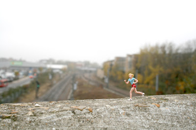
As any SimCity player can tell you, part of what makes that game fun is playing a powerful being that can dink with a giant city. It's fun to feel big, or at least, it's fun to look at tiny things.

London-based slinkachu  creates tiny urban tableaux from miniature figures placed in satirical and surprising settings. You might find police investigating a drowning victim in a puddle, or thrill-seekers riding a real snail. Pictures of the tiny people close up and then from a pedestrian point of view makes clear the exaggerations in scale and through these contrasts the comedy works.

San Francisco-based artist Krista Peel has created a large number of doll house-inspired miniature art projects. Her 2009 calendar project, Public Park  provided a 52" x 30" HO scale park and invited fellow artists to create scenes to place in the park. The Candy Land-colored scenes combine miniature whimsy with a landscape that seems real enough that you find yourself wishing that it was.
What's the critical place of scale in fun? These projects suggest a few answers–surprising juxtaposition, childlike wonder at toy-sized objects, unexpected collisions of naive and serious content and, well, there's just something magical about tiny pretend people.

Posted by email from buzzcut blog (posterous)
Uncategorized , 0 Comment

Public Art WTF? Part 2

Nov
10
Viewed from a distance, the pile of big read beans, or bags, on the east end of the 16th street pedestrian bridge, looks sort of like a pile of frosting or a Dr. Suess Christmas tree. Once you get closer, the color is a deep red that makes you think of blood and the limp elements look like sand bags, or melted candy. It's an image both disturbing and funny.

Lacking any other context, at the moment, than police tape, it's not clear whether the piece is a temporary exhibit, still unfinished, or some well-intentioned comment about the war. As I looked at the sculpture a man walking by muttered, "Body bags?".
Public art can serve a number of functions from creating beauty and repose in a busy place to asking questions and engaging citizens. And at this point, while I don't care for the piece much on its own, nestled in the looping concrete and steel ramp of the pedestrian bridge, it provides a jarring moment in the otherwise cleanly modern city stroll. It just gives you something to look at (in fact the color and shape demands that you look at it) pulling your eye way from the shops, apartments and city traffic all around you. This is active public art that demands a dialog. Not surprisingly, then, graffiti has already appeared, a sort of aesthetic comment left on the base of the piece like some urban blogger answering the boisterous argument of the original work.
I don't know if the bloody beans sculpture is any good. But it is fun!

See and download the full gallery on posterous

Posted by email from buzzcut blog (posterous)

Uncategorized , 1 Comment